
Starting-point valuations are a core anchor in forecasting long-term equity market returns.
Shiller CAPE (cyclically adjusted price-to-earnings ratio) has been widely used as such an anchor but suffers from backward-looking biases in its calculation as a result of index-constituent changes over time.
Current Constituents CAPE (“CC CAPE”) is a modified construction of CAPE that uses the current index constituents and offers potentially improved predictive power, particularly over the medium term.
All versions of CAPE show that equity markets are currently expensive, but CC CAPE indicates that the current AI euphoria has not created a bubble as large as that of the dotcom bubble of 2000.
We come not to bury the cyclically adjusted price-to-earnings (CAPE) ratio but to raise it. Contrary to any misconceptions, CAPE is far from dead. Because conventional CAPE (or Shiller CAPE) has been the target of so many criticisms, with some being valid, it is understandable that many investors are skeptical of the model’s usefulness in forecasting long-term returns. In our quest to enhance the applicability of CAPE, we propose a modified approach called CC CAPE that is designed to correct a specific weakness and improve its forecasting ability.
Create your free account or log in to keep reading.
Register or Log in
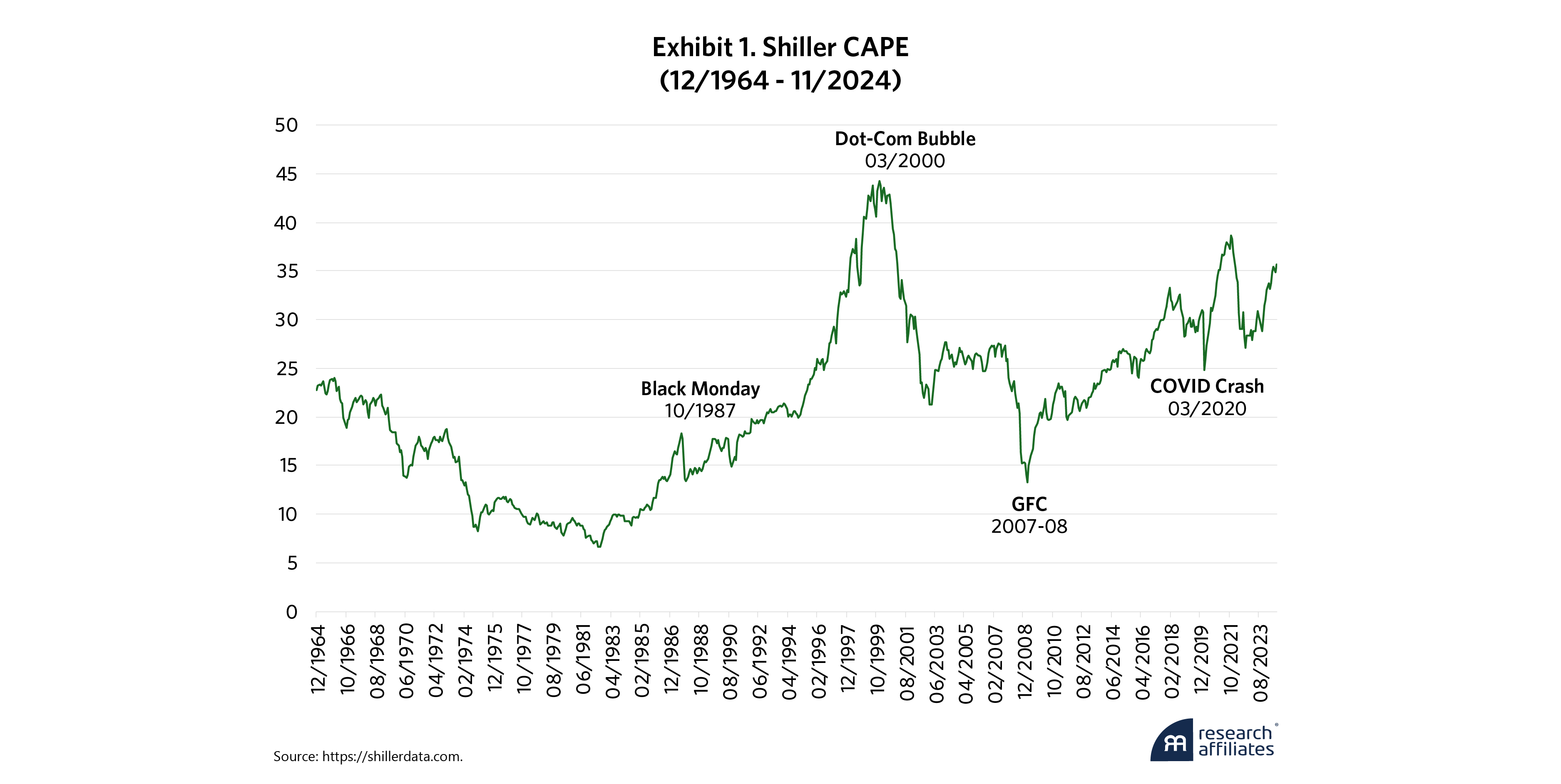
Understanding CAPE’s history can help explain why improvements are needed. First proposed in 1988 by Robert Shiller and John Y. Campbell and inspired by an earlier observation by Benjamin Graham, CAPE was designed to adjust for the short-term cyclicality associated with earnings. Shiller and Campbell simply calculated the ratio of price to an average of real earnings per share over the previous 10 years. Their idea remained relatively obscure until it suddenly came to prominence in 1996 when Shiller presented it to the Federal Reserve, highlighting CAPE’s indication that the dotcom bubble had driven the market to extreme valuation levels.
In that historical moment, CAPE performed the service of returning to the tried-and-true principle that the best predictor of future returns is starting-point valuation. When CAPE was compared with 10-year forward returns, it presented clear and convincing evidence that the stock market had become unreasonably expensive, suggesting poor future returns.
When the dotcom bubble collapsed in 2000, CAPE was acclaimed for its predictive power, establishing the conventional use of applying it to forecasting S&P 500 returns. Over the next couple of decades, however, CAPE’s subsequent performance became less convincing in the eyes of some critics, who argued that it consistently underestimated future returns and was too bearish, as displayed in Exhibit 1. Criticisms offered by CAPE skeptics included changes in accounting standards, lack of accounting for real interest rates, and (most controversially) a fundamental shift to elevated valuations as the new normal.
We have addressed many of these criticisms in the past. Our prior work has acknowledged that Shiller CAPE is an imperfect and incomplete model and should not be used as a “silver bullet” for predicting market behavior. However, starting-point valuation remains a powerful core anchor of future long-term equity returns. Rather than discard Shiller CAPE, we have chosen to use it in combination with other models to improve robustness. CC CAPE further boosts robustness of Shiller CAPE by applying a modified, forward-looking method of calculation.
CC CAPE further boosts robustness of Shiller CAPE by applying a modified, forward-looking method of calculation.
”Current Constituents CAPE: A Much-Needed Upgrade
Over the past few years, we have written about an inherent problem with traditional capitalization-weighted indexes. They routinely add stocks priced at a high market valuation and delete stocks priced at a deep discount to market valuation. The S&P 500 follows this pattern by design, buying high and selling low.
This index-reconstitution behavior by cap-weighted indexes heavily influences the calculation of the 10-year average real earnings of these indexes. S&P 500 Shiller CAPE is calculated as the current index price divided by the 10-year average real earnings of the S&P 500 based on the constituents as they existed at each point in time over the past 10-year period. This approach means that the earnings of companies that were recently dropped from the index will still be included in most of the historical earnings used to calculate the 10-year average earnings, while the earnings of newly added companies will only be included in the historical index earnings starting from the point of addition.
To correct for this backward-looking index bias, our proposed calculation (Current Constituents CAPE or “CC CAPE”) takes an alternative approach. For each of the current constituent companies of the S&P 500, its market cap is divided by the 10-year average earnings, adjusted for inflation. CC CAPE combines these individual-company CAPE ratios using a weighted average. If index changes did not have a bias toward buying high and selling low, CC CAPE and Shiller CAPE would be very similar. But because index changes do tend to buy high and sell low, CC CAPE will tend to be higher than Shiller CAPE.
A recent example illustrates the difference between CC CAPE and Shiller CAPE. In December 2020, the S&P 500 Index added Tesla and deleted Apartment Investment and Management (AIV). As we noted at the time (see here and also here), it was a classic example of a cap-weighted index buying high and selling low.
The calculation of Shiller CAPE would not have included Tesla’s earnings losses in the decade before being added to the index, but it would have included AIV’s modest earnings. The denominator would have been larger as a result of including AIV’s positive earnings instead of Tesla’s negative earnings. In contrast, the calculation of CC CAPE would have excluded AIV’s earnings history as soon as the stock was dropped from the index and would have included Tesla’s previous decade of negative earnings as soon as it was added. This approach would have made the denominator smaller. If Tesla’s market cap at the time of inclusion was also proportionally smaller than that of AIV, the impact on CC CAPE versus Shiller CAPE would not have been so large. On the contrary, Tesla’s market cap at the time of inclusion dwarfed that of AIV, exacerbating the difference and making CC CAPE higher than Shiller CAPE.
Of course, a simple historical example involving only two companies is essentially an anecdote. How do CC CAPE and Shiller CAPE compare over time for a larger sample of companies? To find out, we apply them to the S&P 500 from 1964 through 2024, as shown in Exhibit 2.
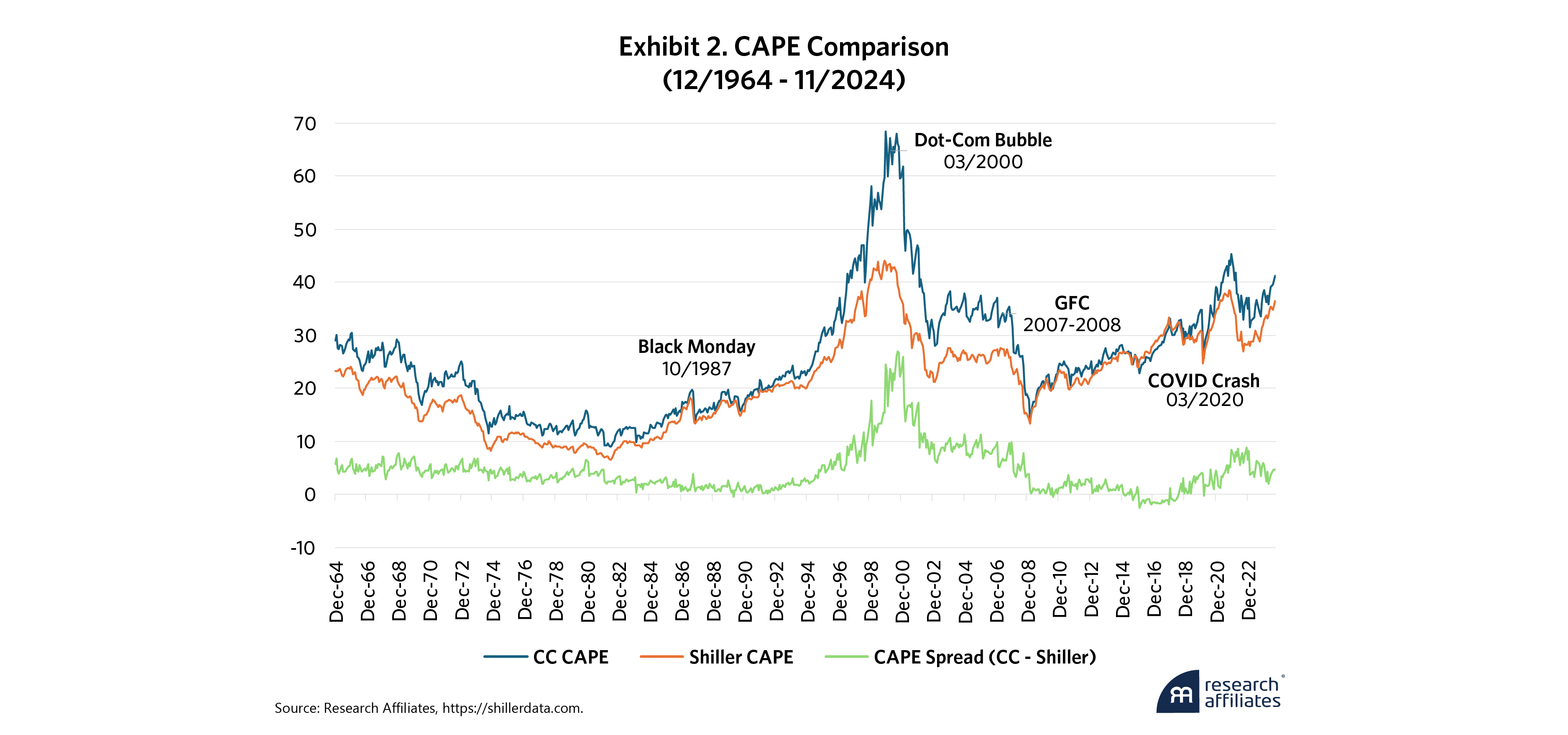
The blue line represents our CC CAPE approach using current constituents, and the orange line represents Shiller CAPE. More significantly, the green line shows the difference between them, which we term the CAPE Spread.
As expected, CC CAPE is persistently higher than Shiller CAPE, and the CAPE Spread varies primarily in how positive it is relative to zero. This positive spread is consistent with the observation that the S&P 500 tends to remove companies that are less expensive relative to earnings, replacing them with companies that are more expensive relative to their earnings. Interestingly, though, the CAPE Spread is unstable over time.
If the CAPE Spread were relatively static over time, it would indicate that the S&P 500 index changes over time had consistent pace and consistent relative valuation trade-offs between additions and deletions. But the high variability in the CAPE Spread tells another story. Why does the green line show so much variability?
If the S&P 500 index did not change its constituents over a long period of time, CC CAPE and Shiller CAPE should eventually converge. Instead, the increasing divergence between CC CAPE and Shiller CAPE could be a result of a faster pace of index changes, more extreme valuation discrepancies assigned to stocks involved in the index changes, or both.
Such a combination of a high number of index changes and valuation euphoria contributed to the peak spread between CC CAPE and Shiller CAPE during the dotcom bubble (as tracked by the green line). During this period, the S&P 500 committee dropped many companies with cheaper valuations and added companies with weaker earnings and larger price run-ups. Indeed, the CC CAPE line peaks above 68 in December 1999, compared with Shiller CAPE’s peak of 44. The large gap between the two types of CAPE can be attributed to the “irrational exuberance” of both the investing community and the index providers. In fact, extreme valuations for a small number of companies that were added can explain much of the spread in the two CAPE ratios. For example, when Yahoo was added to the S&P 500 in December 1999, Yahoo’s market cap of more than $100 billion contrasted with its earnings of less than $100 million, giving it a P/E of more than 1000. In this manner, the CAPE Spread can be considered a sentiment indicator of the level of exuberance that exists in the equity markets and indexes.
The CAPE Spread can be considered a sentiment indicator of the level of exuberance that exists in the equity markets and indexes.
”Why CC Cape Matters
Because CC CAPE’s use of current constituent holdings is less backward-looking than Shiller CAPE’s approach, it could improve forecasting power. Statistical analysis supports our thesis, as shown in the correlations table, Exhibit 3, below. For all periods examined, CC CAPE exhibits a stronger relationship with future returns. The improvement is most pronounced for the shorter periods (1 year, 3 years, and 5 years), as observed in the correlations. At the 10-year horizon, CC CAPE’s improvement relative to Shiller CAPE remains but is less prominent. More striking is the correlation of the CAPE Spread with future returns. At the 1-, 3- and 5-year horizons, it surpasses the predictive power of either Shiller CAPE or CC CAPE. At the 10-year horizon, its predictive power wanes.
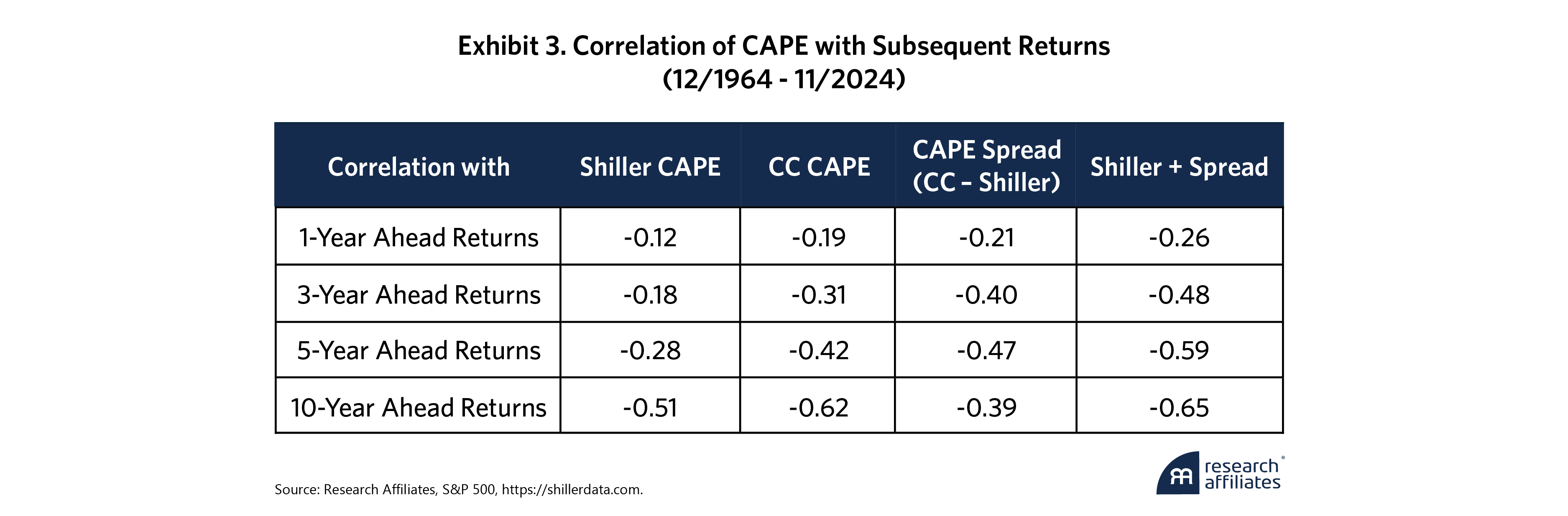
The improvement that CC CAPE exhibits relative to Shiller CAPE is not surprising to us. Because CC CAPE incorporates all the cumulative changes to the index in its calculation, it measures starting-point valuations in a more timely and accurate way. The reduction of CC CAPE’s improvement over a longer forecast horizon is also not surprising. Over the next 10 years, index changes are bound to occur. Since we cannot forecast the frequency or nature of these changes, CC CAPE’s current constituents become stale over this period, and thus, CC CAPE’s timeliness advantage gradually fades over a longer forecast horizon.
More interesting is the performance of the CAPE Spread over medium forecast horizons. As we have posited above, CAPE Spread reflects the level of irrational market sentiment embedded in markets and indexes. Sentiment indicators, such as the frequently quoted VIX index, are often contrarian indicators of market direction over the short term, whereas CAPE Spread performs best over medium horizons of 3 to 5 years. While CAPE Spread explicitly measures sentiment, it is also correlated with valuations, reaching extremes when valuations also reach extremes. CAPE Spread’s superior performance over medium horizons indicates that both valuations and sentiment are important over this time period. Over a 10-year horizon, however, starting-point valuations remain more important than starting-point sentiment and CC CAPE and Shiller CAPE outperform CAPE Spread.
Ultimately, the best explanatory power for future returns comes from combining Shiller CAPE and CAPE Spread because this combination contains information about both starting-point valuations and sentiment. As the table above shows, combining them (i.e., Shiller + Spread) more than doubles the correlation with future returns at the shorter horizons of 1, 3, and 5 years compared with using Shiller starting valuation alone. Starting-point valuations indicate that equity returns are likely to disappoint at some point in the next 10 years, whereas CAPE Spread serves as an early warning signal as to whether that disappointment could be just around the corner.
What This Means for Investors Today
From the analysis above, we glean two lessons. First, consistent with prior analyses, high levels of CC CAPE and Shiller CAPE warrant caution over the long term. Second, when the CAPE Spread is unusually large, investors should take note over the medium term.
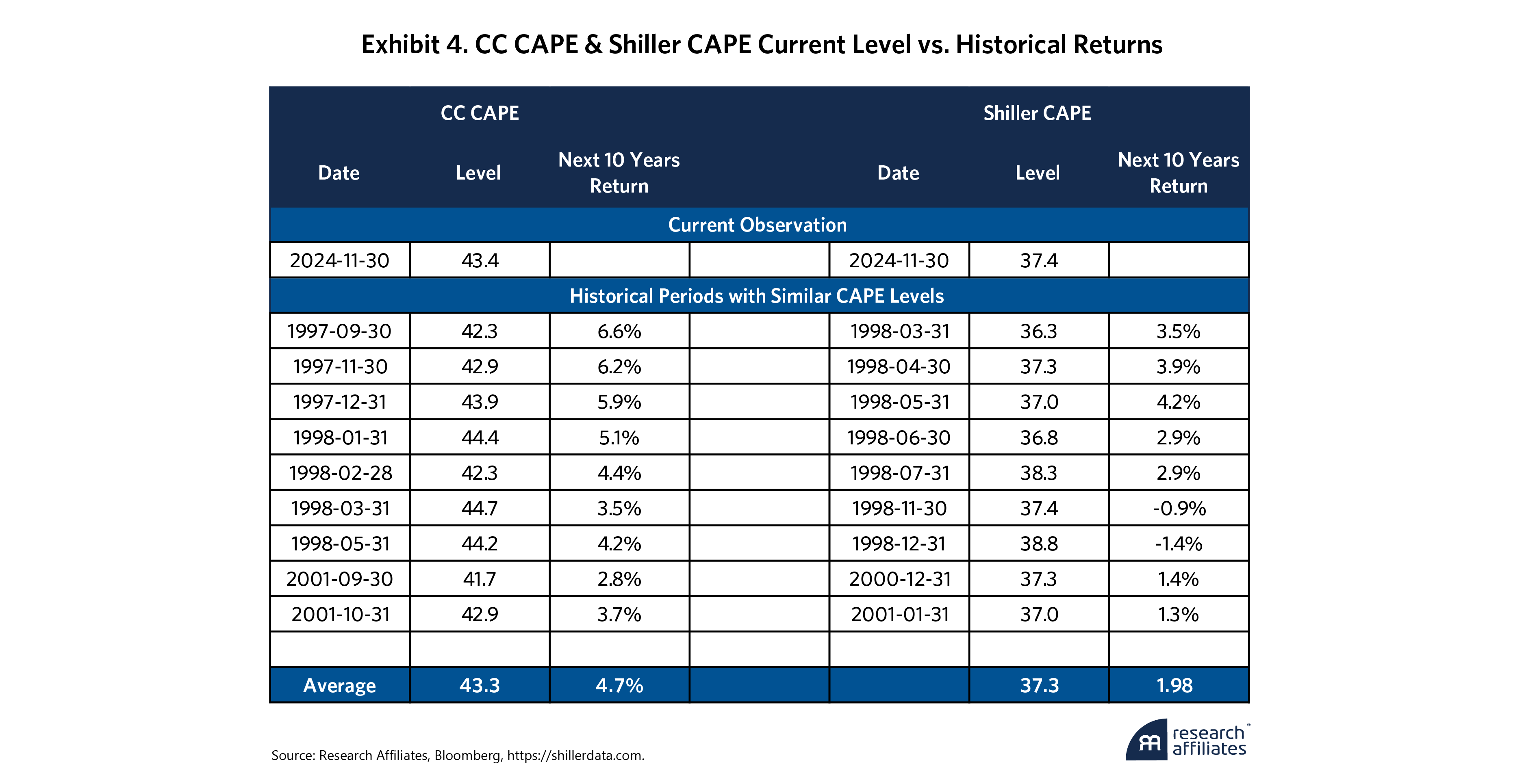
Both CC CAPE and Shiller CAPE are at elevated levels today—in the top decile of historical observations, respectively. This degree of elevation implies muted long-term expectations for both indicators. Using history as a guide, we can observe that for past periods when CC CAPE was at a level similar to today, annualized returns over the next 10 years averaged 4.7%. The same calculation based on Shiller CAPE yields 10-year returns averaging 2.4%. The exact periods used in these calculations are shown in Exhibit 4. Both CC CAPE and Shiller CAPE underscore the current richness of the market, especially considering that 10-year Treasuries are now yielding almost 5%.
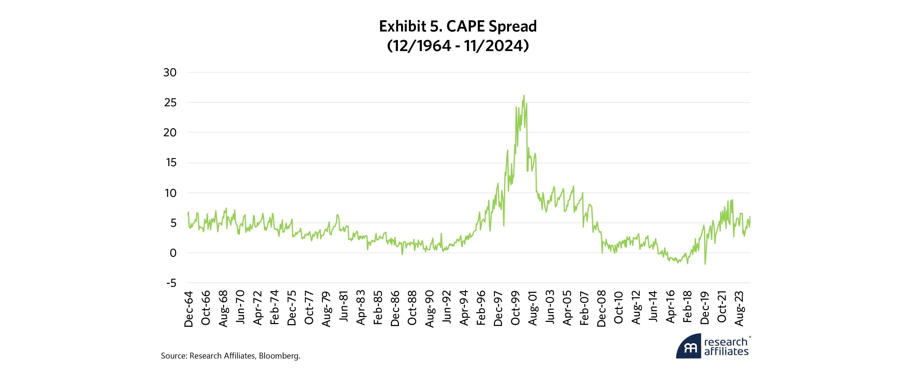
The CAPE Spread (Exhibit 5), which represents market sentiment, is less elevated. It has risen significantly since 2015, but currently, the spread is not as large as that observed in 2000. This indicates that the levels of irrationality at the peak of the dotcom bubble do not yet exist in today’s markets and indexes. Although notable index changes have occurred, such as Super Micro Computer in March 2024, the changes so far have been fewer and the company fundamentals have been more reasonable than the infamous examples that transpired during the dotcom bubble. However, the increased level of optimism since 2015 is apparent. This elevated enthusiasm may not yet be a red light for equity risk-taking, but when taken in combination with elevated CAPEs, we could be facing a flashing yellow.
Please read our disclosures concurrent with this publication: https://www.researchaffiliates.com/legal/disclosures#investment-adviser-disclosure-and-disclaimers.


References
Arnott, Rob, Vitali Kalesnik, and Jim Masturzo. 2018. “CAPE Fear: Why CAPE Naysayers Are Wrong” Research Affiliates (January).
Masturzo, Jim. 2017. “CAPE Fatigue.” Research Affiliates (March).
Arnott, Rob, Vitali Kalesnik, and Lillian Wu. 2018. “Buy High and Sell Low with Index Funds!” Research Affiliates (June).
Arnott, Rob, Vitali Kalesnik, and Lillian Wu. 2020. “Tesla, the Largest-Cap Stock Ever to Enter S&P 500: A Buy Signal or a Bubble?” Research Affiliates (December).
Arnott, Rob, Vitali Kalesnik, and Lillian Wu. 2021. “Revisiting Tesla’s Addition to the S&P500: What’s the Cost, Before and After?” Research Affiliates (June).
Arnott, Rob, and Forrest Henslee. 2024. “Nixed: The Upside of Getting Dumped.” Research Affiliates (August).
Campbell, John Y. and Robert J. Shiller, July 1988. "Stock Prices, Earnings and Expected Dividends," from Journal of Finance. Vol. XLIII, No. 3, pp. 661-676.
Jivraj, Farouk and Shiller, Robert J., “The Many Colours of CAPE” (October 13, 2017). Yale ICF Working Paper No. 2018-22
Siegel, Jeremy J., “The Shiller CAPE Ratio: A New Look,” May 2016. Financial Analysts Journal, Volume 72, No. 3, pp. 41-50.
